SANKU MAOTS’AI / CASE NOTES
How do you turn choice into appetite?
A bowl of possibilities. A website full of character.
01 / THE IDEA
Start with
possibility.
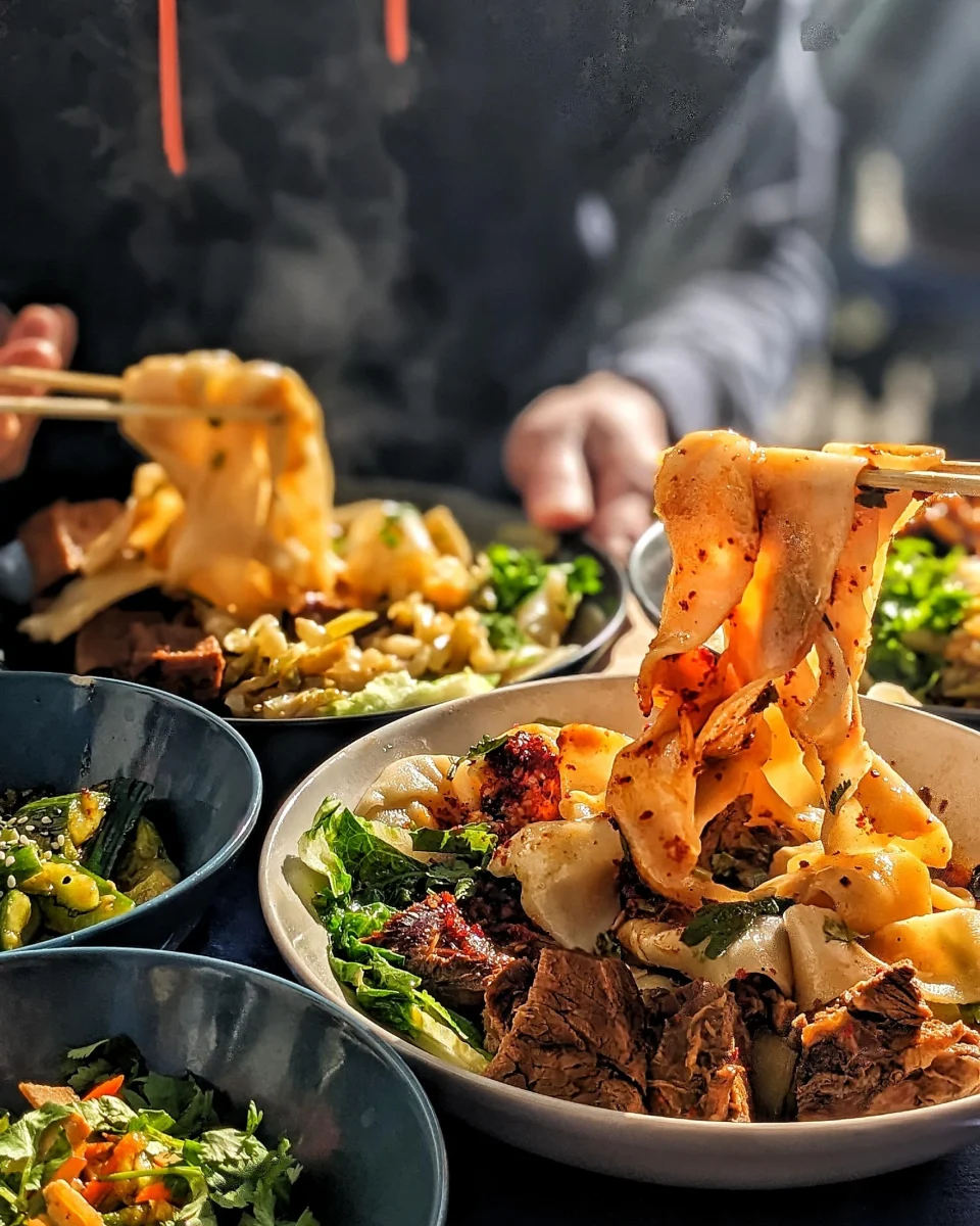
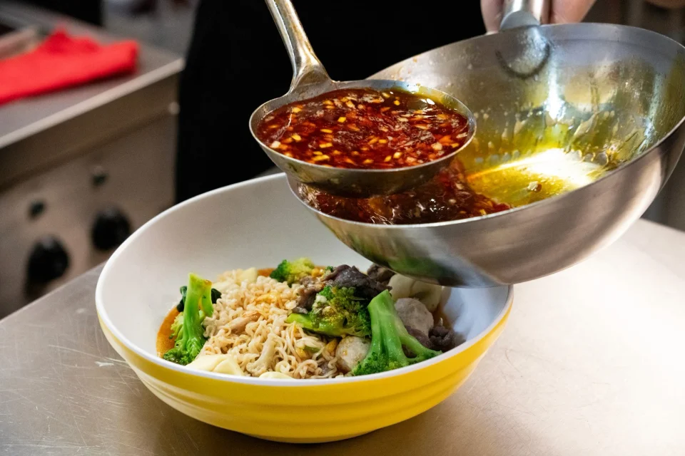
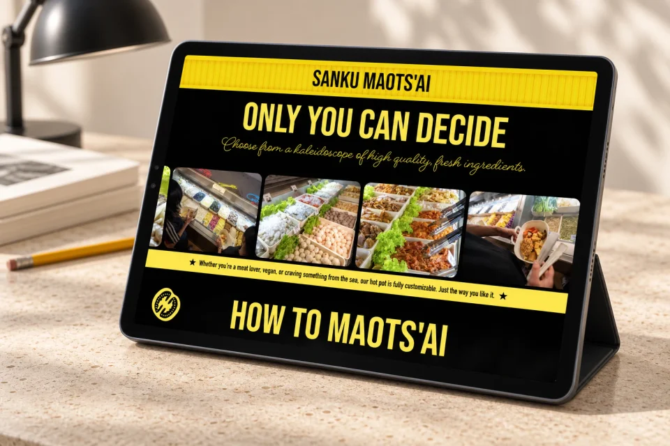
At Sanku Maots’ai, the bowl begins with a choice. The website introduces that idea through generous food photography and a vivid yellow-and-black identity.
The ingredient section opens that choice up: photographs of the counter and people filling bowls turn variety into something tangible. Condensed lettering and flowing script frame the experience.
Food photography / bold typography / personal choice
02 / THE EXPLORATION
Give choice
a clear rhythm.
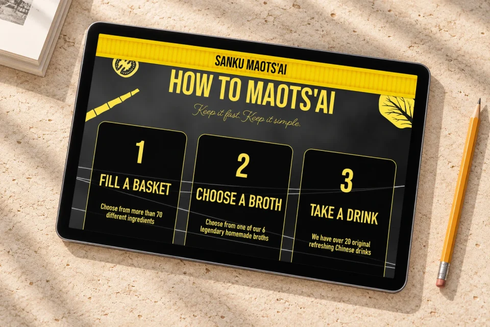
The How to Maots’ai section turns an unfamiliar meal into an approachable sequence: ingredients, broth, then a drink. Three numbered cards make that progression easy to follow.
The same graphic language continues through the guide. Yellow outlines, oversized numerals and ingredient illustrations give practical information a character of its own.
Three-step guide / visual hierarchy / ingredient-led storytelling
03 / WHERE IT LANDED
From a bowl
to Berlin.
The live website connects the food with the visit. Its Berlin location section brings the map, opening hours and directions together, with a clear invitation to come by.
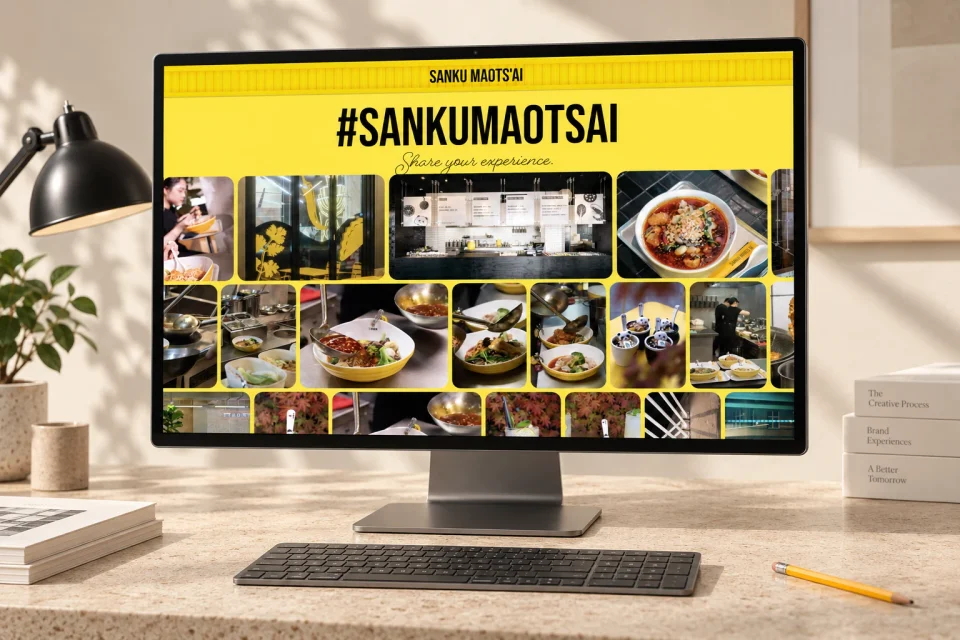
The closing photo gallery brings the restaurant into view: bowls, preparation, interiors and people around the food. A bright yellow backdrop gathers those moments into one final invitation.
Current state / live website · verified September 2026
THE ANSWER, SO FAR
Make the food immediate and the choices clear.
My product photography and web design bring the bowls, ingredients and restaurant information together. The website carries Tom Herman’s art direction and graphic identity into an experience that moves from appetite to planning a visit.