PANDA COFFEE BERLIN / CASE NOTES
How do you give a coffee its own character?
Good coffee. Good karma. A brand with purpose.
01 / THE IDEA
Good coffee.
Good karma.
An everyday ritual can carry a bigger idea. Panda Coffee Berlin was built around the ambition to connect good coffee with conscious consumption, direct trade and social projects. The brand’s own story puts the people and places behind the product at its centre.
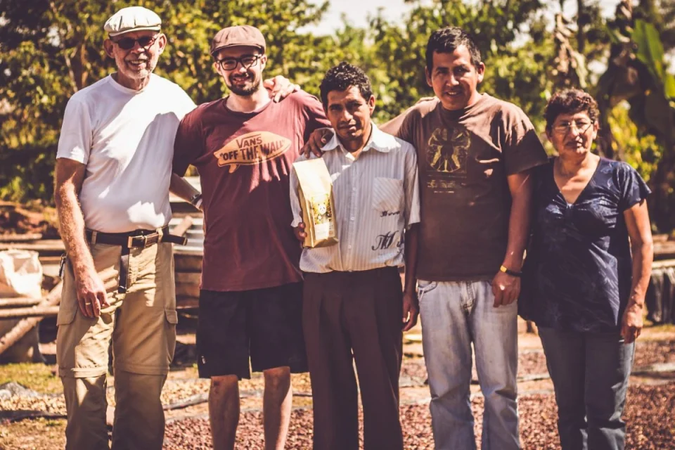
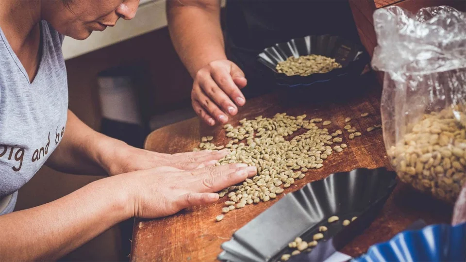
Pacha Mama gives that story a specific origin: the highlands around Miguel Grau in Peru’s Chanchamayo region. The website traces the coffee through shade cultivation, hand picking and careful processing. The photographs bring that journey into view—from the people at its origin to the hands sorting the beans.
My contribution covered brand design, positioning and storytelling, alongside product management and marketing. The task was to give this purpose a character people could recognise and connect with.
Brand purpose / direct trade / origin
2 FILMS / CHOOSE A CUT
Play loads YouTube, which receives connection and viewing data. Privacy details
02 / THE EXPLORATION
From origin
to identity.
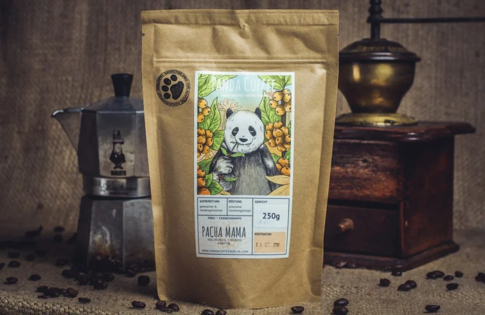
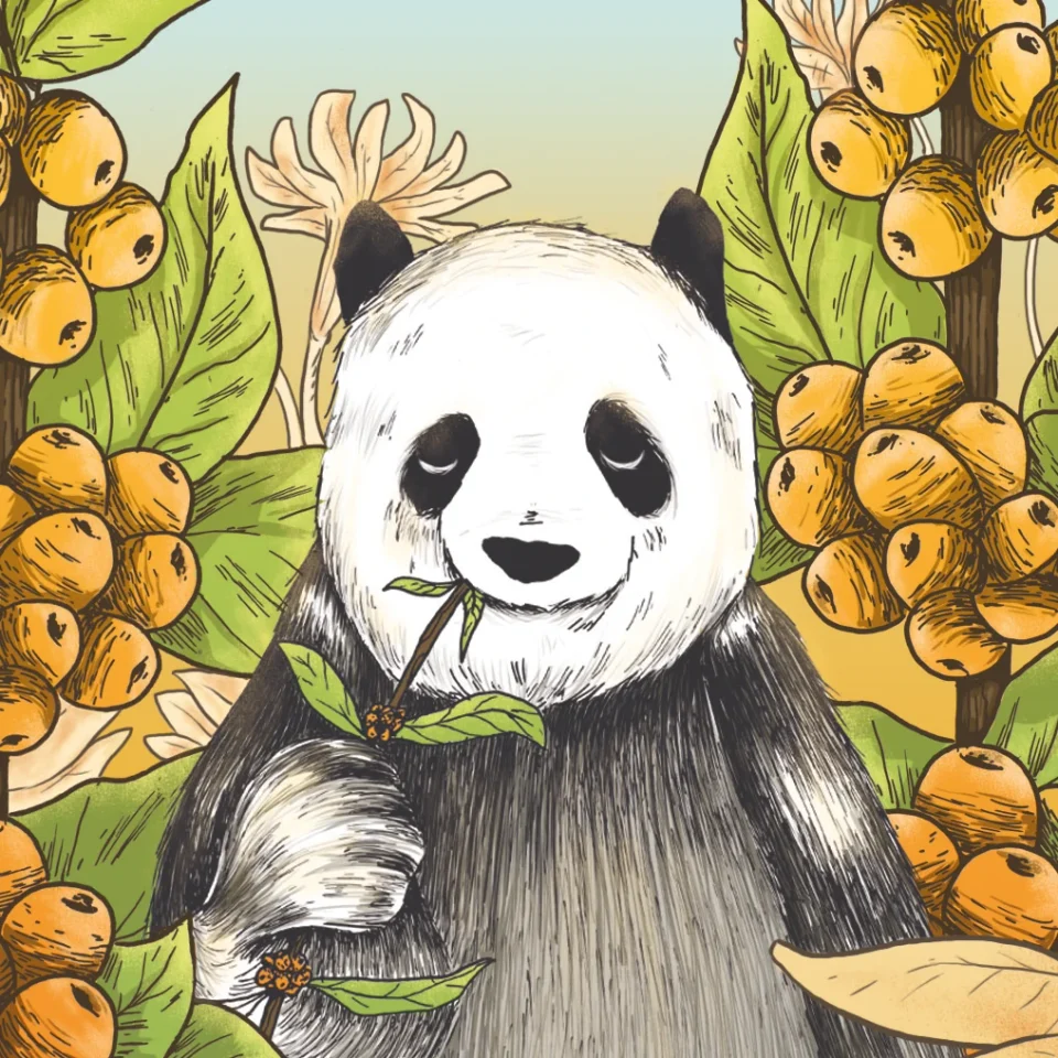
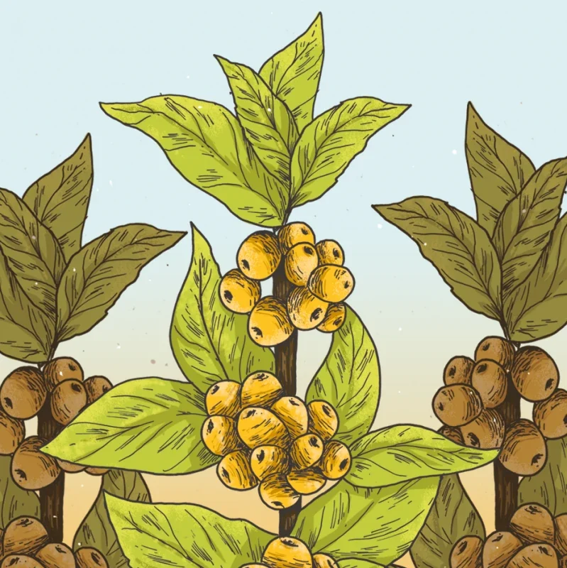
The visual world brings the product’s story into the illustration. Pacha Mama places the panda among leaves and coffee cherries. Cascara carries those botanical forms into another product: a drink made from the dried coffee-cherry husks.
Colour and illustration give each part of the range its own expression while keeping the family recognisable. The source photographs add a different kind of detail: actual people, places and processes alongside the imagined world of the panda.
Together with the brand-values film and the Peru coffee-farm film, the identity connects what is inside the bag with the story around it.
Product family / illustrated identity / film
03 / WHERE IT LANDED
A brand
beyond the bag.
The Pacha Mama packaging turns the identity into something tangible: an illustrated label on a simple kraft bag, part of the everyday ritual of making coffee. In the product photograph, the bag sits beside a coffee maker and grinder.
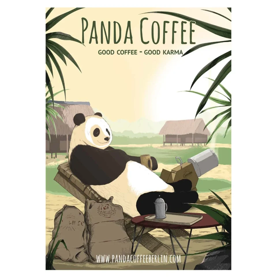
The same visual world has room to grow beyond packaging. The Sonnen-Panda poster gives the character a different setting and a larger format. Across the brand’s website, the illustrations also appear alongside the wider product range and its origin stories.
This selection brings the brand work together through packaging, print, film and the story behind the coffee. It shows how one recognisable identity can connect a product with a wider purpose.
Project archive / packaging / print / brand storytelling
THE ANSWER, SO FAR
Let the story travel with the product.
The brand work connected Panda’s visual identity with packaging, communication and film. My contribution across brand design and product management helped carry the project from its story into the things people see and hold.