ARRET / CASE NOTES
Can we experience a future before we build it?
A shared vision of Earth, given a visual language.
01 / THE IDEA
A future
we can picture.
Arret began with an ambitious question: what if we could explore possible futures for Earth before building them? The idea was a shared digital space where plans for a more sustainable planet could become tangible.
My task was to give that vision a narrative and an identity. Brand design, website and social communication needed to make an abstract proposition feel connected to the world we already inhabit.
Bjarke Ingels’ Masterplanet expands the architectural brief to the scale of Earth, considering how shared systems could respond to planetary challenges. It offers a useful parallel for reading Arret’s ambition: making possible futures tangible. For the identity, that expansive perspective needed an immediate point of connection — a living texture, a recognisable shape, an invitation to look closer.
Planetary thinking / narrative / identity
Play loads YouTube, which receives connection and viewing data. Privacy details
02 / THE EXPLORATION
Connect the story
across scales.
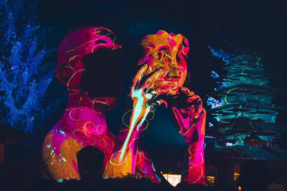
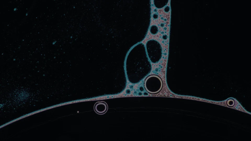
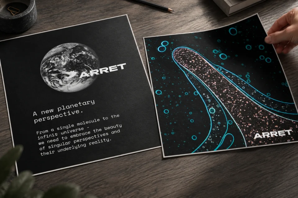
The visual language moves between the planet and the smallest patterns within it. Microscopic forms sit beside images of Earth, finding a common rhythm in branching structures, light and colour.
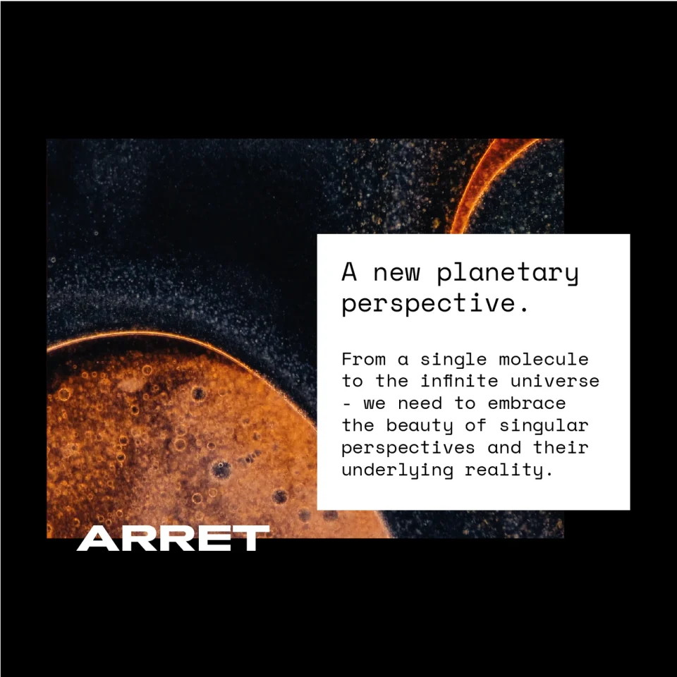
Dark fields give those images space. Direct typography brings the story back into focus. Across the social sequence and website, image and language work together to connect natural complexity with a clear invitation to imagine what comes next.
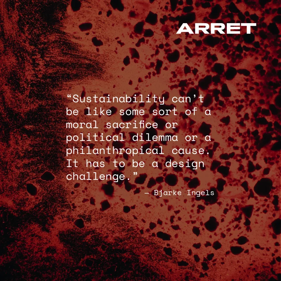
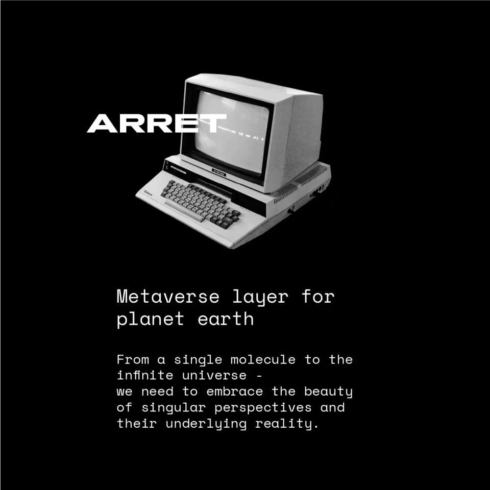
The sequence also changes its register. A red microscopic texture holds a statement about sustainability, while a monochrome computer introduces the digital proposition. This contrast gives the narrative a rhythm between the organic world and the tools used to imagine it.
Micro and macro / image and language
03 / WHERE IT LANDED
Give the vision
a first form.
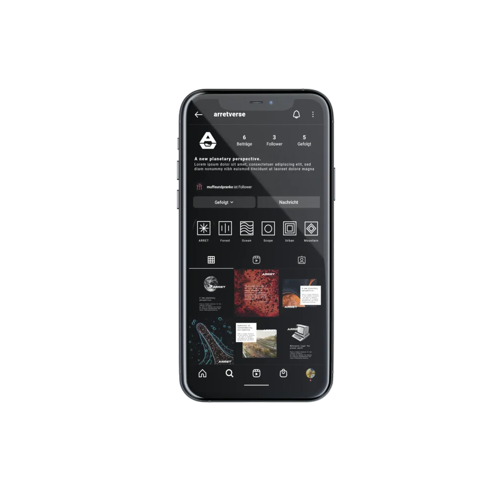
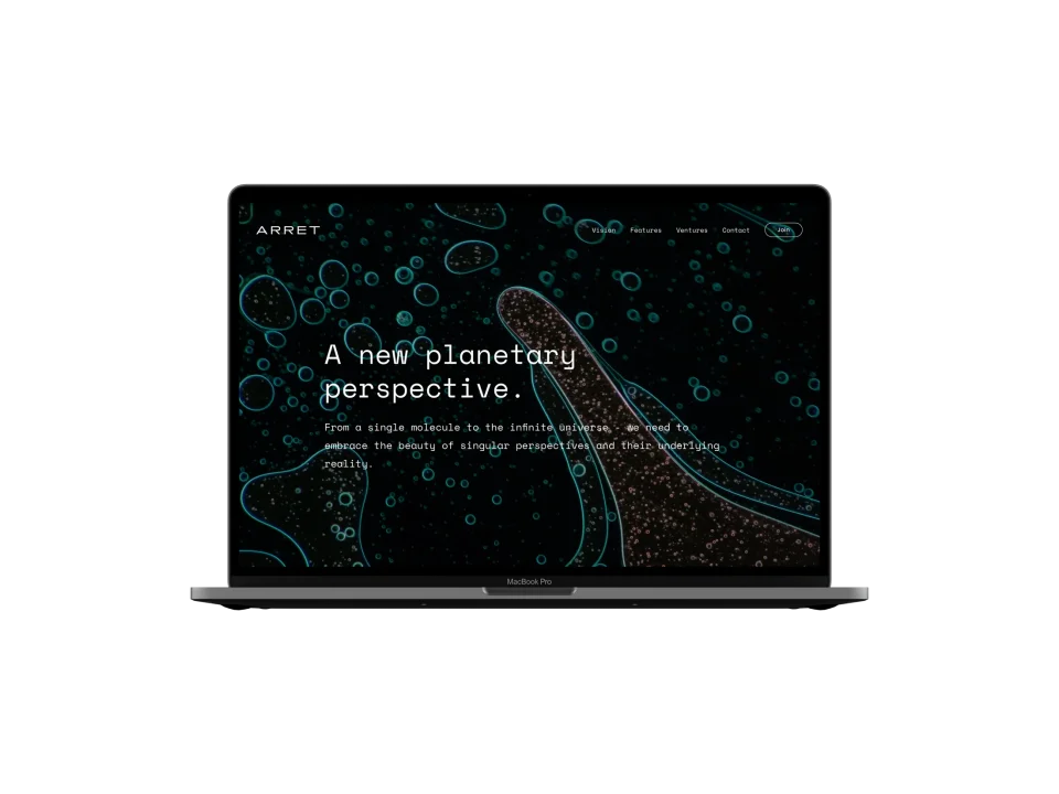
The work brought the proposition into a connected brand, website and social direction. Each encounter introduced the same idea at a different scale: a striking image, a short statement, then a wider view of the project.
The result was a design foundation for a project still taking shape. It gave the planetary ambition a recognisable expression and a narrative to develop further.
The social feed creates a series of entry points; the website gathers them into a fuller introduction. Keeping the same typography, contrast and visual references across both gives the project continuity as people move from a single fragment to the wider story.
Brand foundation / digital direction
THE ANSWER, SO FAR
Give an expansive idea a first, recognisable form.
The planetary proposition became a narrative and visual direction spanning brand, website and social content. The relationship between Earth and microscopic patterns gave the concept a consistent starting point for further development.